Monday, 7 October 2013

Feedback

We presented our presentations in small groups. Whilst each person presented, the rest of the group were to write down feedback and constructive criticism for each. 

As this session was on getting the most out of giving and receiving feedback, from here, we then had to look through our feedback and categorise it - 

Informative/useful feedback 

include more examples
more personal opinions
more focus onto specific area
work on presentation delivery - engage more, read less
aesthetic of slides - distracting?

Boosts ego but pointless

good quotes/facts
thorough research
good historical knowledge
detailed facts
good knowledge on packaging 
good knowing why you're interested in it

Would be useful if more information?

......


From this feedback and own personal views, were then asked to point out 

3 Objectives of how to improve our presentations - 

Make it more personal - more on why I am drawn to the subject - what aspect's intrigue me? Which areas would I like to focus in and why? More examples of my preferences within packaging - which products, companies  designers, aesthetics. 

Work on my presentation delivery - engage more with my audience - use my brain more rather than reading straight from the slides.

More facts & statistics on modern day packaging rather than the past - more outlooks, views and advice from other designers/companies rather than limiting to just one. deeper research - better analysis.

Monday, 30 September 2013

What Interests Me - Product Packaging Research


Product Packaging


What is product packaging design?

Packaging is the science, art, and technology of enclosing or protecting products for distribution, storage, sale, and use. Packaging also refers to the process of design, evaluation, and production of packages. Packaging can be described as a coordinated system of preparing goods for transport, warehousing, logistics, sale, and end use. Packaging contains, protects, preserves, transports, informs, and sells. 

"Packaging on a supermarket shelf has less than three seconds to grab the attention of a consumer."

Those three seconds are exceedingly important when you consider that more than 70% of purchasing decisions are made at the shelf. Add to this the fact that supermarkets can contain on average 40,000 packs to choose from, then that pack has got to work hard.

Sell the product

Protect the product

Facilitate the use of the product


Brief History of packaging

"The first packages used the natural materials available at the time: baskets of reeds, wineskins (bota bags), wooden boxes, pottery vases, ceramic amphorae, wooden barrels, woven bags, etc. Processed materials were used to form packages as they were developed: for example, early glass and bronze vessels. The study of old packages is an important aspect of archaeology.


The earliest recorded use of paper for packaging dates back to 1035, when a Persian traveler visiting markets in Cairo noted that vegetables, spices and hardware were wrapped in paper for the customers after they were sold.

The seeds of agriculture were sown between 11,000 and 12,000 years ago, creating the need for a more effective means of protecting seeds and harvested products. Glass, which emerged in the Far East some 5,000 years before Christ, was one invention destined to revolutionise man’s capacity to conserve and transport goods. At that time, glass was only used to make jewellery, but 1,000 years later the Egyptians used this material to create jars of all kinds.

In the Middle Ages, wooden barrels became the most frequently used way of preserving goods. They were used for storing all kinds of solids and liquids, protecting them from light, heat and dampness. Their considerable robustness allowed them to be transported on the perilous roads of the age and to be carried by boat. It was during the industrial revolution in Europe that packaging really took off. The vast range of products made available to the consumer brought about a change in lifestyle, providing consumers with greater choice and allowing trade to flourish. The need for packaging grew.

From then on, the rate of innovation accelerated. The Frenchman Nicolas Appert invented the can in 1810. Though it was made from glass rather than metal, it represented the birth of a long-term preservation method for food. Canned food was first put to the test by the army during the Crimean wars and during the American Civil War before it became available to consumers.


Iron and tin plated steel were used to make cans in the early 19th century. The cardboard box emerged at the end of the 19th century, a simple yet revolutionary invention. An American, Robert Gair, had the bright idea of manufacturing in bulk a pre-cut cardboard panel which, once folded, would form a box. This made the transportation of goods much easier and the box became the most widely used method of packaging at the beginning of the century due to its very low price and ease of use. Today, boxes are used to supply us with fragile and high-tech equipment, such as video recorders and computers.


In 1920, the invention of transparent cellophane marked the beginning of the era of plastic. Polyethylene, the first plastic used for packaging, was discovered in 1933…by mistake! Aluminium foil, which came later, made it possible to effectively seal medications and other sensitive products.

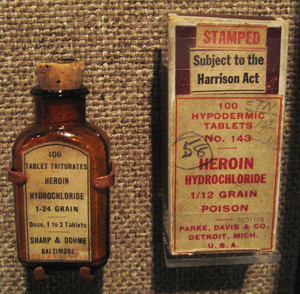
Packaging advancements in the early 20th century included Bakelite closures on bottles, transparent cellophane overwraps and panels on cartons, increased processing efficiency and improved food safety. As additional materials such as aluminum and several types of plastic were developed, they were incorporated into packages to improve performance and functionality.

File:HeroinHarrisonActNOLA.JPG

File:Packing salt packages.jpg

File:1915 contour Coca-Cola contour bottle prototype.png

In 1952, Michigan State University became the first university in the world to offer a degree in packaging engineering.

In-plant recycling has long been common for production of packaging materials. Post-consumer recycling of aluminum and paper based products has been economical for many years: since the 1980s, post-consumer recycling has increased due to curbside recycling, consumer awareness, and regulatory pressure.

Many of the most prominent innovations in the packaging industry were developed first for military uses. Some military supplies are packaged in the same commercial packaging used for general industry. Other military packaging must transport materiel, supplies, foods, etc. under the most severe distribution and storage conditions. Packaging problems encountered in World War II led to Military Standard or "mil spec" regulations being applied to packaging, designating it "military specification packaging". As a prominent concept in the military, mil spec packaging officially came into being around 1941, due to operations in Iceland experiencing critical losses due to what the military eventually attributed to bad packaging solutions. In most cases, mil spec packaging solutions (such as barrier materials, field rations, antistatic bags, and various shipping crates) are similar to commercial grade packaging materials, but subject to more stringent performance and quality requirements. 

As of 2003, the packaging sector accounted for about two percent of the gross national product in developed countries. About half of this market was related to food packaging.


Graphics and packaging design 

Designers have two key tools to grab the consumers’ attention, graphics and structure.

Packaging graphics must do more than simply look pretty. They must work to cut through the white noise that is the crowded supermarket shelf, and attract a potential buyer. Once they attract a buyer's attention, packs don't stop working. Designers have to make sure they convey information, about how much they and their contents cost to buy, the ingredients they contain, and whether or not they can be recycled.

Packaging is also the medium many businesses exploit to convey their brand. 

Colour


The first thing you remember about a brand may well be its colour. Think Cadbury's Dairy Milk purple, Coca-Cola's red or Guinness's black and cream. Colour makes your product recognisable and its important that any packaging designer's response to a brief conveys understanding on what the colours they use will convey, and whether they are going to sit with or challenge convention.

Sometimes the most-effective packs are the most simple. Multiple colours on a pack can be both distracting to the customer and costly to produce, which is why colour rationalisation is becoming increasingly popular.

Story

Building a story into the packaging of a product is becoming increasingly popular way to convey provenance and brand essence. Doing so allows consumers to connect with the product on an emotional level.

Cultural issues 

When designing for different cultures, language, colour, texture, and sensitivity to visual imagery have to be considered. For instance, in some countries pictures animals on packs are consider unlucky or disrespectful.

Illustration

When designing pictures onto a piece of packaging, the feel and tone of illustration and photography should be clearly outlined in the brief from the brand.

Practical considerations like the printing process and substrate onto which the image is going to be printed will also affect how illustrations or photographs are designed onto a pack.

Matt Leese, Director of colour management film Tag, believes it is important to engage consumers "through many channels with one clear message". He explains using the Apple example:

Though the example is used to death – Apple products embody this view perfectly. Jonathan Ive, their product designer, has as much of a handle on the packaging as the products. One could almost say that the packaging forms part of the product. The campaigns are entirely product led and therefore shows a great joined up story.


Structure of packaging

The structure of a pack can serve multiple purposes:
To create shelf standout and sell the product
To protect the product
To prolong the life of the product
To facilitate the use of the product

To reassure customers that it's part of a familar range

Designers create innovative and enticing packaging shapes using computer modelling and CAD visuals before they make mock ups to show how a pack might look and feel. While designing the structure of pack they will think about: 

Creating standout - Some products are instantly recognisable simply from the silhouette of their pack.


Toblerone - Toblerone was created in 1908 by Theodor Tobler and his cousin Emil Baumann. Since then, the triangular Swiss chocolate has become so renound it can even afford to create a pack without the Toblerone name on it because the shape of the pack is so intertwined with the brand.

Protecting the product - The rigours of the supply chain are an often overlooked factor influencing packaging design. Whether it’s biscuits or perfume, packaging’s role is to ensure the product gets to the customer in the intended state. Therefore it is important to run trials to see how the pack performs in the supply chain. There’s no point rolling out a pack if it’s not going to make it to the supermarket shelf.

Making the product easier to use - A quick way to put consumers off a product is to make it totally impractical to use. Packaging design must incorporate functional aspects that allow the consumer to easily use what they buy. Take your average milk bottle, for example. First the consumer must be able to grip the bottle, then unscrew the cap before pouring the milk without it glugging and spilling everywhere. Without packaging designers continually improving on what we've got, this isn't always possible. Remember the trials of trying to prize open a tetrapak carton of milk or the frustration you felt at not being able to reseal the glass bottle once you'd popped off the foil top?
Some of the most popular packs are the simplest. Fairy Liquid has celebrated its fiftieth year this year. While it has since moved away from its original pack, people still have a strong affection for it – not least because of its connections to children’s TV programme Blue Peter. Ultimately, it is a simple pack with a flip-top cap and dimple grips, but it is fundamentally functional and therefore very appealing to the consumer.
Usability is even more important when you consider the pharmaceutical sector. In many case, packs must both be impenetrable by children and yet still be opened easily by older people or people with limited ability. 


Jonathan Sand's ten golden rules for commissioning successful packaging design
Conduct a thorough audit of all competitors in your market before you start, and make sure you understand their respective positionings and attributes. Then create your own.

Look at what is happening in other markets, e.g. if you are just considering the UK or Europe, what is happening in the US or Far East that might give you a point of difference?

Put measures in place at the start so you can track and learn as you go, e.g. measure awareness of and attitude to your packaging now and in the future. A good research agency will tell you how to do this.

Choose a design agency based on its track record, not on price and get testimonials direct from at least three existing clients. Make sure you like them and feel you can work with them.

Be different and ensure your pack has its own visual equity and has a strong personality and attitude.

Make sure your pack works at all stages of its life cycle, from leaving the factory to ending up in the user's hands.

Protect your pack in terms of trademark law and copyright and make sure you're not infringing your competitors' rights.

Mock up how your pack would look alongside your competition. Test it in store and make sure it really does leap out at point of purchase.

Design with tomorrow in mind. Create a pack that is in keeping with current market trends and future trends.


Consider doing some pre-market testing to make sure your pack will find a willing audience. But be careful how you test it as consumers never quite know what they are looking for until someone shows them something new. Henry Ford once said: 'If I'd listened to what people wanted I’d have built a faster horse!'


Contemporary packaging design

FIREWOOD VODKA


Ginsters Reinterpretation


Blackbeard Rum


The Meat Up


COCOTTE Eggs


The Bees Knees

33 Creative Guerrilla Product Packaging Examples Guerrilla Marketing Photo

Prism Eyewear

33 Creative Guerrilla Product Packaging Examples Guerrilla Marketing Photo

Nike Shoe Stadium Packaging

33 Creative Guerrilla Product Packaging Examples Guerrilla Marketing Photo

Kleenex Creative Packaging

33 Creative Guerrilla Product Packaging Examples Guerrilla Marketing Photo

33 Creative Guerrilla Product Packaging Examples Guerrilla Marketing Photo

Medicom Pharma: Target Heavy Food

33 Creative Guerrilla Product Packaging Examples Guerrilla Marketing Photo

33 Creative Guerrilla Product Packaging Examples Guerrilla Marketing Photo

Scanwood Packaging Design

33 Creative Guerrilla Product Packaging Examples Guerrilla Marketing Photo

Smirnoff Vodka Packaging

33 Creative Guerrilla Product Packaging Examples Guerrilla Marketing Photo

33 Creative Guerrilla Product Packaging Examples Guerrilla Marketing Photo

33 Creative Guerrilla Product Packaging Examples Guerrilla Marketing Photo

Wednesday, 25 September 2013

What Interests Me - Illustration Research


Illustration  


What is illustration 

An illustration is a visualization or a depiction made by an artist, such as a drawing, sketch, painting, photograph, or other kind of image of things seen, remembered or imagined, using a graphical representation. The word comes from the latin word illustra'tio, illu'stro meaning enlighten, irradiate.

Illustrations can be artistic images illustrating for example a text, poem, fashion, magazines, stamps or a book and very often illustrations were made for for childrens books.

Illustrations have been used in advertisements, greeting cards, posters, books, graphic novels, storyboards, manuel, business, magazines, shirts greeting cards, video games and newspapers etc.. A cartoon illustration can add humor.

An illustrator is a narrative artist who specializes in enhancing writing by providing a visual representation that corresponds to the content of the associated text. The illustration may be intended to clarify complicated concepts or objects that are difficult to describe textually, which is the reason illustrations are often found in children's books.


Traditional illustration techniques include watercolor, pen and ink, airbrush art, oil painting, pastels, wood engraving, and linoleum cuts.


Cartoons


A cartoon is a form of two-dimensional illustrated visual art. While the specific definition has changed over time, modern usage refers to a typically non-realistic or semi-realistic drawing or painting intended for satire, caricature, or humor, or to the artistic style of such works. An artist who creates cartoons is called a cartoonist.

The term originated in the Middle Ages and first described a preparatory drawing for a piece of art, such as a painting, fresco, tapestry, or stained glass window. In the 19th century, it came to refer to humorous illustrations in magazines and newspapers, and in the early 20th century and onward it referred to comic strips and animated films.

A cartoonist is a visual artist who specializes in drawing cartoons. This work is often created for entertainmentpolitical commentary or advertising. Cartoonists may work in many formats, such as animation, booklets, comic strips, comic books, editorial cartoons, graphic novels, manuals, gag cartoons, graphic design, illustrations, storyboards, posters, shirts, books, advertisements, greeting cards, magazines newspapers or video game packaging.


45 Markets of Illustration
A Passion to Illustrate
by John Roman

An overview of the numerous markets that currently exist for illustrators reveals a surprisingly vast and deep pool of potential freelance opportunities. Originally compiled as an aid for my illustration classes at Massachusetts College of Art and Design, Boston, the list catalogs many lesser-known, supplementary markets beyond the traditional, more-populated avenues for illustration assignments. Despite limited budgets in some areas, the demand for quality illustration remains high in many esoteric markets. Illustrators with a passion to earn a living by way of their art are forging new career paths as current economics make “specializing” essential.
EDITORIAL, ADVERTISING AND PUBLISHING
A brief inventory of the more familiar venues includes editorial illustration, which has changed dramatically since the “golden days” of Norman Rockwell. Yet, today hundreds of smaller trade magazines still rank as potential clients. Book illustration covers commercial, trade and education, while children’s illustration includes books, but can reach beyond to educational publishing. Also, advertising continues to be a strong base.

Comic book and comic strip illustration are distinct, yet similar fields. The comic book artist will usually work with a team of artists, each providing a specialty to the final comic. Comic books cover much more ground than stereotypical “superheroes.” Non-fiction graphic novels, educational comics, children's comics, self-published and underground “zine” publications and even comic books designed to sell products or promote public issues are prevalent. Comic strip artists work individually or in partnership with another writer or artist. Strips branch into markets such as advertising but most are published/syndicated for newspapers and the Web.

Humorists who enjoy cartooning but are not interested in comic books or comic strips, can find a place in the world of humorous illustration. Humorous art touches editorial, advertising, publishing, computer games and toys and limited-edition prints. Similarly, humorous illustrators with an interest in politics can express their viewpoints through political cartooning. The room on this stage is tight, however, and it's best to start locally if one has hopes to enter the state or national scene.

One’s imagination sets the limits for fantasy and science fiction. There’s a worldwide hunger for science fiction, fantasy and new-age/spiritual art. Book covers, magazines, graphic novels, video and computer games, tarot cards, astrology products, Halloween art and religious items barely skim the surface of the demand in this ever-growing emporium. An awareness of the trends will make a career in this genre a reality.

MEDICINE AND SCIENCE
Medical illustration is a technically oriented, science-based art, the importance of which is immeasurable. Its production has evolved significantly over the years and the field remains strong. Medical artists also delineate animal biology.

The unique field of archaeological illustration involves traveling to distant lands, living on-site with archaeologists and rendering all aspects of a geological/archaeological dig. Archaeological art may be the right path for those who love to travel, are enthusiastic about history and science, and who wish to blend those interests with their love of drawing. Botanical illustration is an area for artists with a knowledge of and interest in plants and who can accurately and stylistically render flora of all types. The roots of this market reach into several industries.

Biological illustration and marine biology art address separate scientific disciplines. A biological artist details the microcosmic worlds of the plant, animal and insect kingdoms, while a marine artist depicts both the microcosmic and macrocosmic realms of aquatic life. Those who admire and study birds are well aware of ornithological illustration. Accurate and aesthetically illustrated bird life, in all mediums, is sought after by book publishers and research organizations. Animal illustration ranges from technical animal art to all types of animal/pet portraits for the public; it’s also in demand by the science and publishing trades as well as producers of farm and pet products.

TECHNICAL, GRAPHIC AND INFORMATIONAL
Infographic/technical illustration ranges from informational and instructional imagery to “how-to” assembly drawings. Offshoots include 2-D/3-D charts, graphs and diagrams. A separate category of infographics is courtroom presentation art. Unlike traditional courtroom drawings, the graphics produced are used in trial courts to explain complex cases in layperson’s terms. These artists work with medical people, insurance personnel and others servicing the legal profession.

Licensing artists develop customized art and graphics for t-shirts, skateboards, snowboards, surfboards, hats, jackets, emblems and even those dynamic illustrations on the backboards of pinball machines. A bold style that translates well on all forms of merchandise is essential. A community of artists dedicate their careers to illustrating postage stamps; the US Postal Service holds competitions for new stamps, as do the US Fish and Wildlife Service and the Canadian Postal Service. Map illustration ranges from 2-D informational cartographics to fully illustrated 3-D scenes. With a history that predates the written word as a means of visual storytelling, historians credit illustrated maps as the oldest form of art.

Perspective artists concentrate on architecture and building cutaways for construction-related publishing and advertising clients, while exhibition design artists render presentations for museum exhibits, diorama displays and theater stage sets. This type of illustrator works under the direction of a museum, theater group, historical site or retail/commercial firm.

Automobile illustration of contemporary and classic cars is a niche for related magazines, books and prints. Employment at an auto manufacturer might also involve illustrating designs of new vehicles. Artists who create customized vehicle graphics are highly sought-after by car, motorcycle and truck enthusiasts. The best way to learn this trade is to apprentice at an existing shop for a few years. From drawing on someone’s car to drawing on someone’s body, a career as a tattoo artist is a field that requires little explanation.

HISTORICAL AND DOCUMENTARY
Well-delineated historical illustration is needed by books, magazines, historical organizations and educational institutions. Closely related to this field is the category of military illustration, which involves historical or contemporary scenes of military life and/or battle depictions. Artists fond of watercraft might seek a career in nautical illustration, rendering maritime subjects from small boats to cruise ships. Similarly, there is the specialized field of aeronautical illustration.

Portraits of dignitaries, industrialists, celebrities, political figures, as well as portraits or caricatures of the common person are produced for numerous clienteles. Documentary illustration involves courtroom drawing, police sketch art, caricatures and any type of illustration created on-location. Sports illustration spans editorial, publishing and galleries; specialties include golf course landscapes, cartoon/comical sports art, fitness instructional drawings and historical images of sports personalities.

PRODUCT AND FASHION
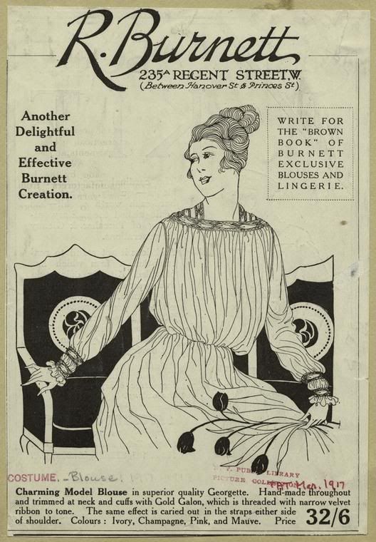
Product illustration is a specialized field servicing advertising, industrial and commercial accounts with detailed views of existing or proposed products. Some artists focus solely on food; national restaurant chains, food manufacturers, cookbook publishers, ad agencies, wineries and dining and travel magazines exemplify the types of companies seeking food art. Fashion drawings are not always created by fashion designers. Manufacturers hire artists to illustrate new design creations while retail chains commission illustrations of fashions they carry. Connected to this industry, the fabric pattern artist fills an avid need for new textile designs and patterns.

Greeting card and gift illustration is art created for cards, wall coverings, paper plates, napkins, calendars, school supplies, holiday banners and shopping bags. It also includes the collectible market with designs for figurines and chinaware.

GALLERY, PRINTS AND ENTERTAINMENT
Fine artists work on self-initiated projects such as landscape, still life and figurative imagery. The limited-edition print artist is the most independent, in complete control of subject matter, marketing and even the financing of print production (unless contracted by a licensing distributor).

Sidewalk artists liven the festivities of public occasions with their varied styles. “Anamorphic” is a new form of sidewalk art (stretched images that look 3-D when seen from a specific point of view). From drawing on a sidewalk to drawing on a wall, the career of a muralist includes working for educational institutions, corporations, city and town beautification committees, urban property owners, retailers and homeowners.

Feature films are not the only outlets for animators. Educational films, computer games, commercials and training films for industry and government also employ animators. A storyboard artist works on-site with a film’s director and cinematographer to interpret every scene for a movie. Other clients for storyboard art include ad agencies, educational filmmakers and television. Finally, concept artists create characters, vehicles, props and environments for use in video games and movies. All fictional worlds need concept art for their design aspects.

CHOOSING YOUR MARKET(S)
A web search of any markets listed will uncover obscure, satellite markets not mentioned here. In addition, illustration “societies” exist for most markets (The Society of Architectural Illustrators, The National Cartoonists Society). Art societies reveal detailed information about their specialties. In the end, it’s most important to honor what you love to do. Artists should not choose a market simply for monetary reasons, or because one’s peers are influencing a decision. An illustrator’s interests must come from the heart so that love will emanate in the work.


History of illustration


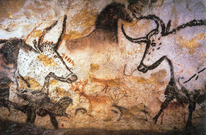
Beginning of the caveman times - First signs of 'illustration'. Bulls of the Lascaux caves


Roman Greece - Carvings on the entrances to brothels in Pompeii


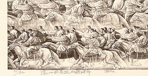
 (200 AD) Woodblock Printing


Illuminated Manuscript.egg_d8905

(476 AD- 1492 AD) Medieval illustrations accompanying the manuscripts. 

Books were made working over coat or cow leather and using the “illumination” technique, decorated with thin layers of gold to illuminate the illustrations.

An illuminated manuscript is a manuscript in which the text is supplemented by the addition of decoration, such as decorated initials, borders (marginalia) and miniature illustrations.


1430 - Intaglio Printing - etching onto metal (zinc/copper) plates 


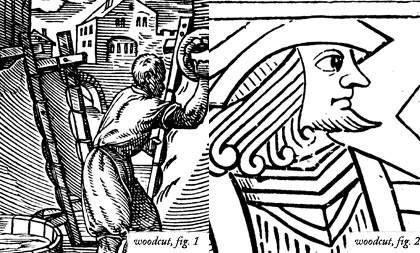
1439 - The Gutenberg Press was invented - Reign of woodcut illustrations 

16th - 17th Century - extended use of the Etching and engraving techniques.


1796 - Lithography 

In the lithographic process, ink is applied to a grease-treated image on the flat printing surface; non image (blank) areas, which hold moisture, repel the lithographic ink. This inked surface is then printed—either directly on paper, by means of a special press.


1837 -  Chromolithography

This is process of printing color pictures from a series of stone or zinc plates by lithography.

19th century - Moved more towards wood engraving, which could more easily be incorporated into pages of text. 

Book and journal publishers would employ workshops of wood-engravers to render artists’ drawings onto polished blocks of fine-grained yew or box-wood which could then be locked directly into the printing-chase with the metal type

1843 -  Rotary printing press

A rotary printing press is a printing press in which the images to be printed are curved around a cylinder. Printing can be done on large number of substrates, including paper, cardboard, and plastic.

Some information to have in mind for the second half of the 19th century - 

The Industrial Revolution.

The declining of the Censorship Laws in France (Daumier had to stop his political caricatures because of them).

The massive migration of artist that developed the Social Realism (known as Realism too) to England.

The influences of Pre-Rafaelite Brotherhood, Arts and Crafts Movement, Asthetic Movement , The Art Noveau, Les Nabis, the Impressionism and the Post-Impressionism.

In this period was the Golden Age of the Victorian Illustration (UK) and it began the Golden Age of the American Illustration. The American "golden age of illustration" lasted from the 1880s until shortly after World War I (although the active career of several later "golden age" illustrators went on for another few decades). As in Europe a few decades earlier, newspapers, mass market magazines, and illustrated books had become the dominant media of public consumption. Improvements in printing technology freed illustrators to experiment with color and new rendering techniques. A small group of illustrators in this time became rich and famous. The imagery they created was a portrait of American aspirations of the time.

 Illustrators contributed to satirical and straight-fiction magazines, but in both cases the demand was for character-drawing that encapsulated or caricatured social types and classes.


Some well known illustrators of the 19th Century -

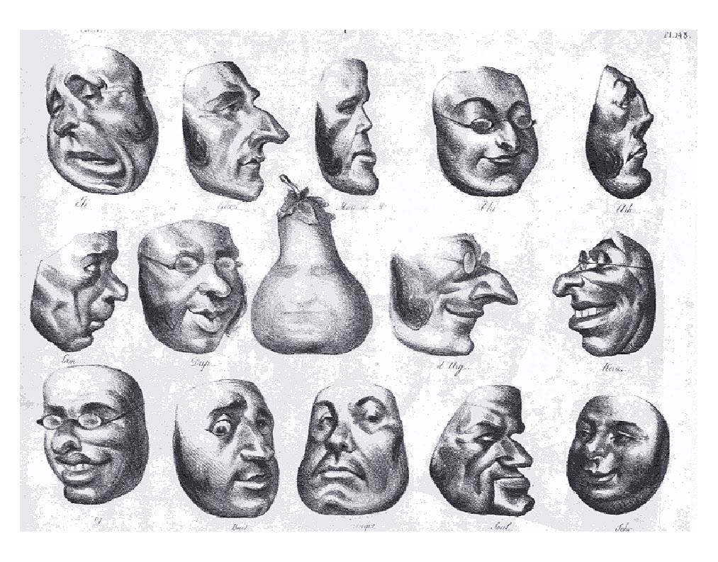
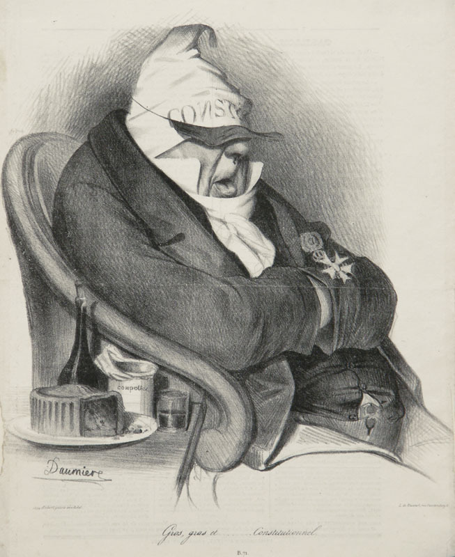
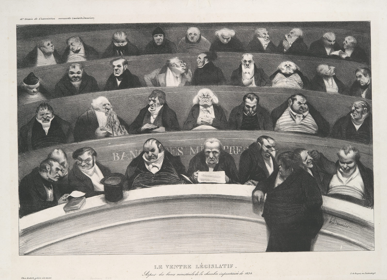
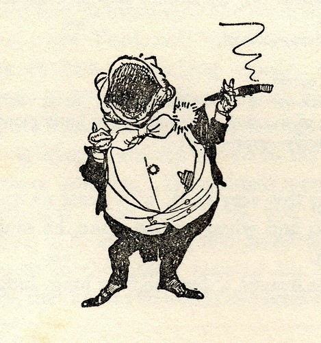
Honoré Daumier - Prolific French caricaturist, painter, and sculptor especially renowned for his cartoons and drawings satirizing 19th-century French politics and society.

The work of Daumier really intrigues me as the realistic yet exaggerated cartoon like style brings humor and stands out from most of the illustration at the time.  


Daumier-5


George Cruikshank - British caricaturist and book illustrator, praised as the "modern Hogarth" during his life. His book illustrations for his friend Charles Dickens, and many other authors, reached an international audience.


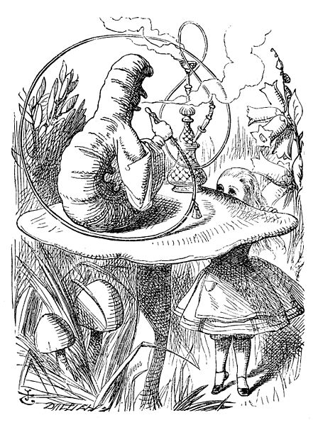
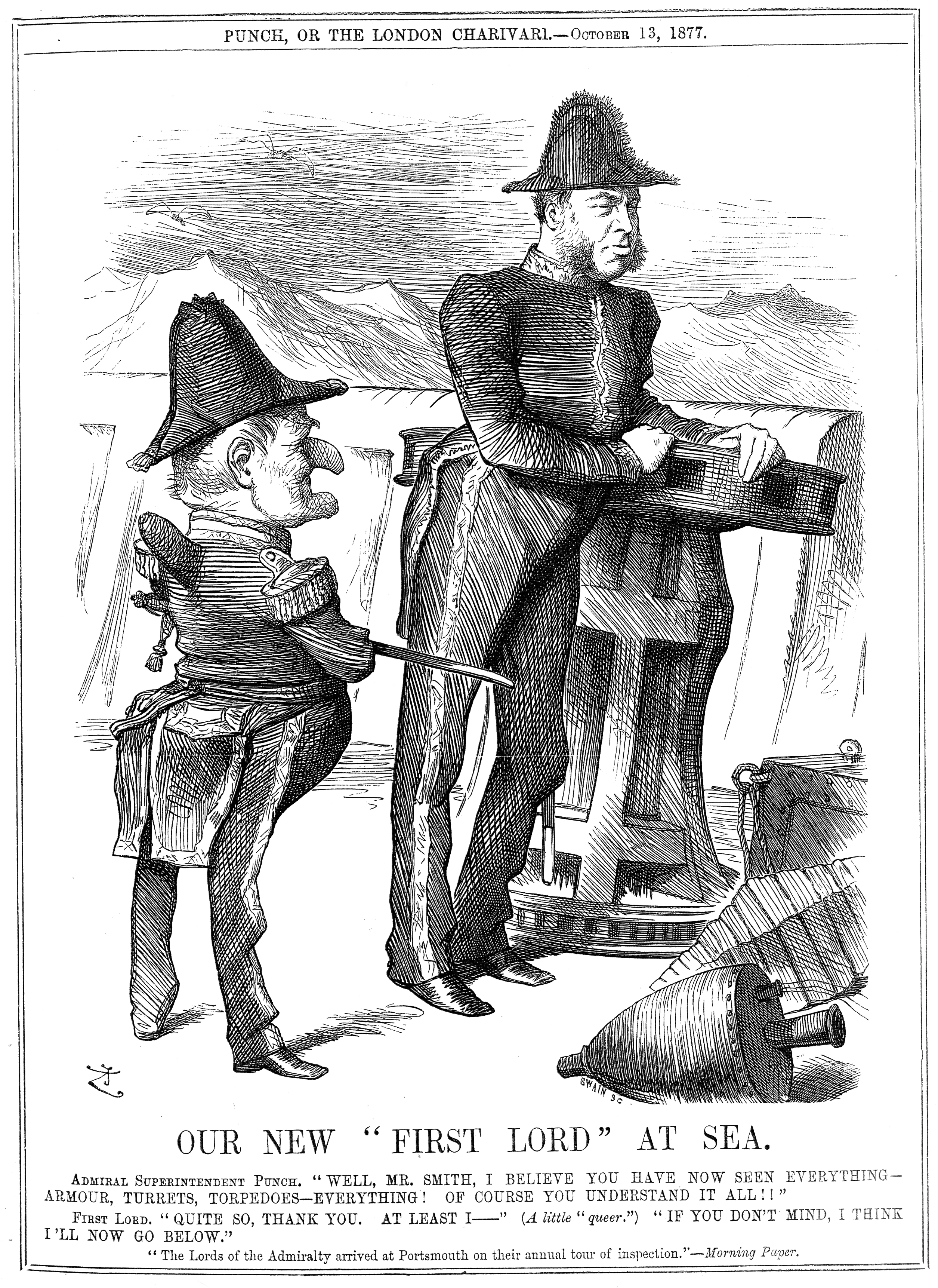
John Tenniel - British illustrator, graphic humourist and political cartoonist whose work was prominent during the second half of England’s 19th century. Tenniel is considered important to the study of that period’s social, literary, and art histories. Tenniel was knighted by Victoria for his artistic achievements in 1893.

Tenniel is most noted for two major accomplishments: he was the principal political cartoonist for England’s Punch magazine for over 50 years, and he was the artist who illustrated Lewis Carroll’s Alice’s Adventures in Wonderland and Through the Looking-Glass.

File:Alice 05a-1116x1492.jpg


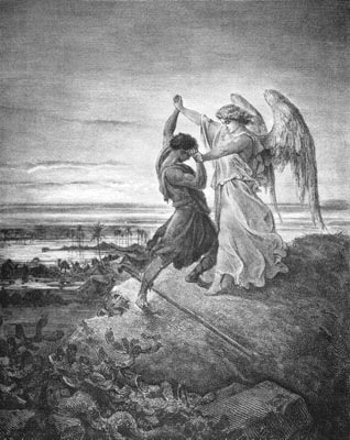
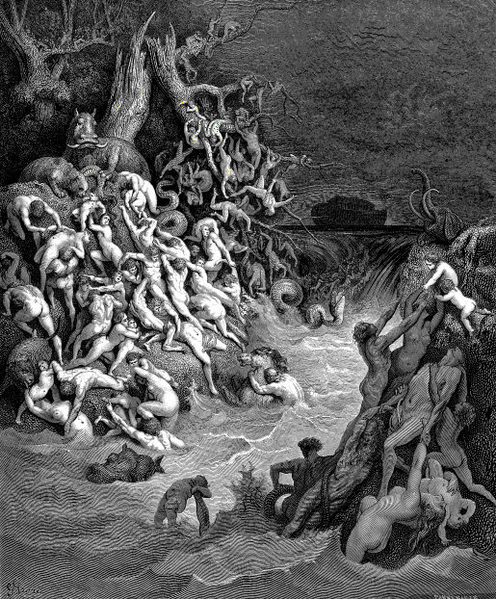
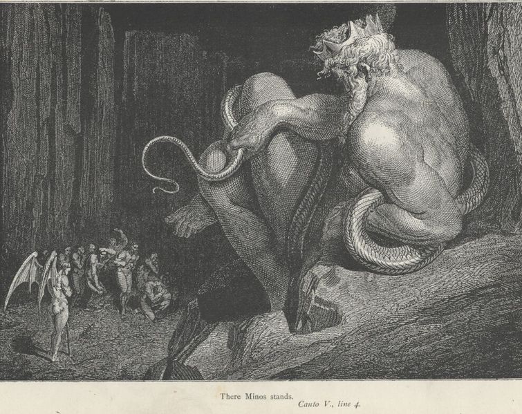
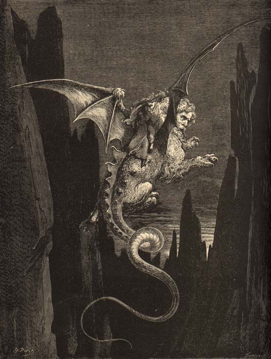
Gustave Doré - French illustrator , painter and sculptor . Doré was largely self-taught and worked as an illustrator since he was 16 years old. He contributed illustrations to approx. 90 books, including a Bible edition from 1866.

Fil:Jacob-angel.jpg

Fil:World Destroyed by Water.png

Fil:Inferno Canto 5 line 4 Minos.jpg


Beatrix Potter - English author, illustrator, natural scientist and conservationist best known for her imaginative children’s books featuring animals such as those in The Tale of Peter Rabbit which celebrated the British landscape and country life.


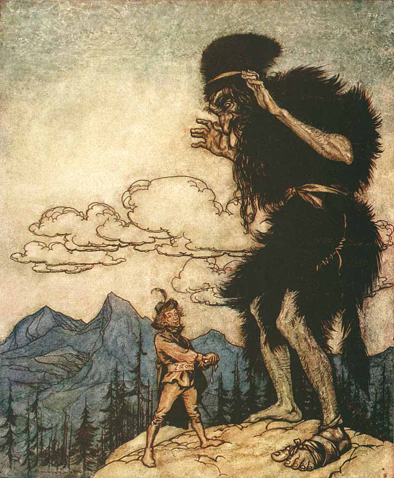
Arthur Rackham - English book illustrator


Aubrey Vincent Beardsley - English illustrator and author. His drawings in black ink, influenced by the style of Japanese woodcuts, emphasized the grotesque, the decadent, and the erotic. He was a leading figure in the Aesthetic movement which also included Oscar Wilde and James A. McNeill Whistler.


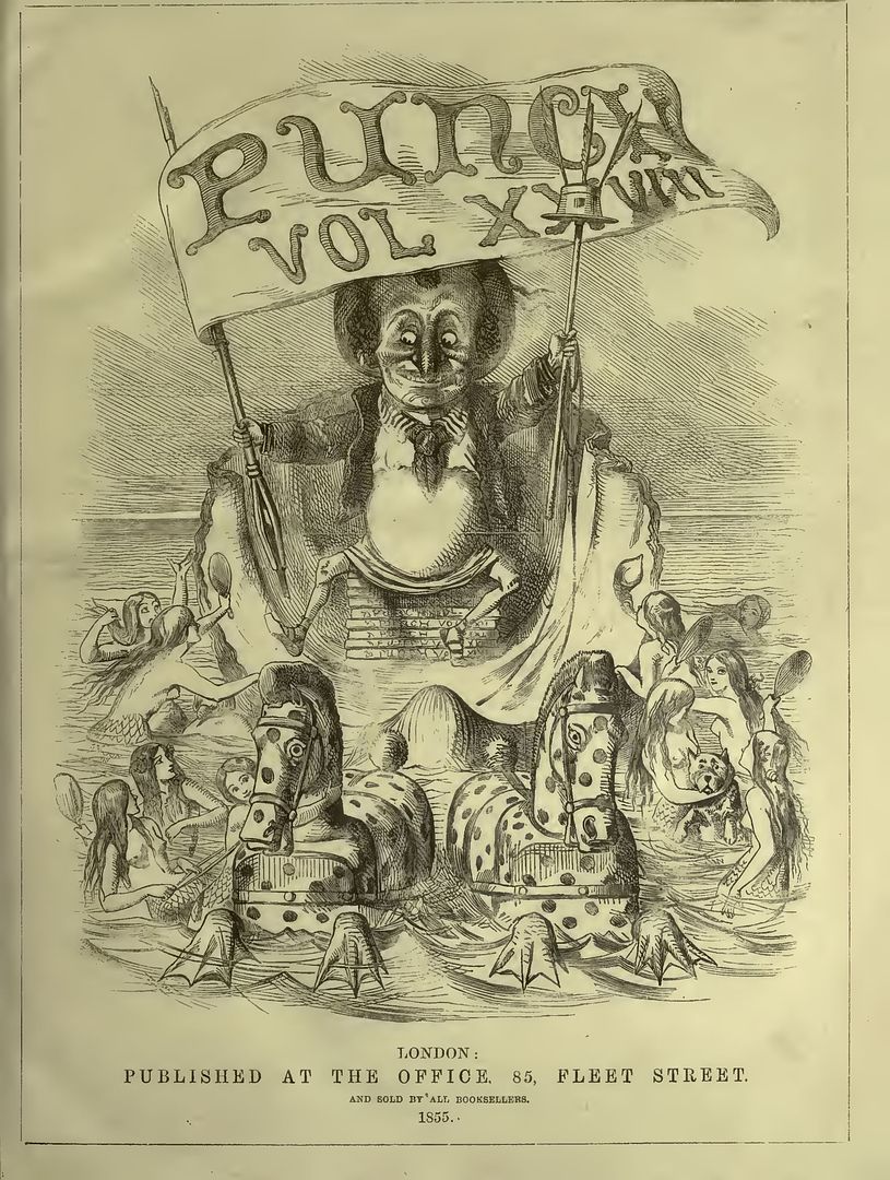
Punch Magazine - (or the London Charivari) was a British weekly magazine of humour and satire established in 1841 by Henry Mayhew and engraver Ebenezer Landells. Historically, it was most influential in the 1840s and 50s, when it helped to coin the term "cartoon" in its modern sense as a humorous illustration. It became a British institution, but after the 1940s, when its circulation peaked, it went into a long decline, finally closing in 1992. It was revived in 1996, but closed again in 2002.

http://punch.photoshelter.com/


20th Century 

Early 20th Century -

In England, books were very expensive. the target market of the books was the adults, However there was a huge market for the books for children with wealthy parents. England was the center for the Book production.

America was the center for Magazines production

The rising of the poster as a medium for the Advertising

Invention of screen printing

Influence of the First World War 

1930s - The Great Depression


Illustration within Design and Advertising


"The profession of illustration developed in tandem with the profession of advertising and the two have been intertwined and somewhat dependent on each other since their beginnings. Before the popularity and feasibility of photographic reproduction advertising depended on illustration as the means of producing visual images to compliment the message of advertisements. The invention and success of the computer has not replaced traditional illustrators but has given them a new set of tools to create and develop varying visual styles of illustration. Advertising agencies often contract out to a variety of freelance illustrators for their project-specific needs as illustrators often have a unique aesthetic that may or may not lend itself to the message of the client.

Many illustrators have found a home somewhere in-between the fields of design and illustration and work on a range of projects ranging from poster illustrations to company logos. Hybrid illustrators and designers are able to offer their clients a wider range of services so that the client does not have to budget for the cost of two different studios or individuals. The graying lines between the two fields have created a wider field as the design profession has become increasingly saturated with clients and professionals."


Illustrators of the early 20th Century

Howard Pyle - American illustrator and author, primarily of books for young people. Sometimes called the Father of American Illustration, he wrote and illustrated dozens of books, largely fairy tales, fables and other stories.


C_kidd_4x

HP_Bunker_Hill_72

Jean de Brunhoff - French writer and illustrator known for creating the Babar books, the first of which appeared in 1931

Jean de Brunhoff 1

Jean de Brunhoff 8


Howard Chandler Christy - American artist and illustrator famous for the "Christy Girl"

Howard Chandler Christy 3

Howard Chandler Christy 4

Howard Chandler Christy 5

James Montgomery Flagg - American artist and illustrator. He worked in media ranging from fine art painting to cartooning, but is best remembered for his political posters

James Montgomery Flagg 1

James Montgomery Flagg 6


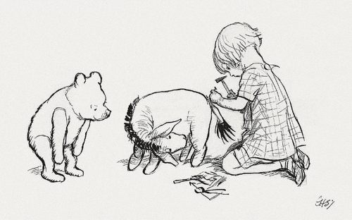
E. H. Shepard - English artist and book illustrator. He was known especially for his human-like animals in illustrations for The Wind in the Willows by Kenneth Grahame and Winnie-the-Pooh by A. A. Milne.


Late 20th Century 

The Second World War

1949 - First Photocopier

1969 - First Laser Printer

America - image of the Housewife and the images of lifestyles according to the American Dream

TV

Dr Seuss - (Theodor Seuss Geisel)  American writer, poet, and cartoonist most widely known for children's picture books written and illustrated as Dr. Seuss. Geisel published 46 children's books, often characterized by imaginative characters, rhyme, and frequent use of anapestic meter. His most celebrated books include the bestselling Green Eggs and Ham, The Cat in the Hat, The Lorax, One Fish Two Fish Red Fish Blue Fish, Horton Hatches the Egg, Horton Hears a Who!, and How the Grinch Stole Christmas!.


Dr Seuss 2


Dr Seuss 8

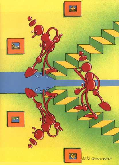
Victor Moscoso - Spanish artist best known for producing psychedelic rock posters/advertisements and underground comix in San Francisco during the 1960s and 1970s.


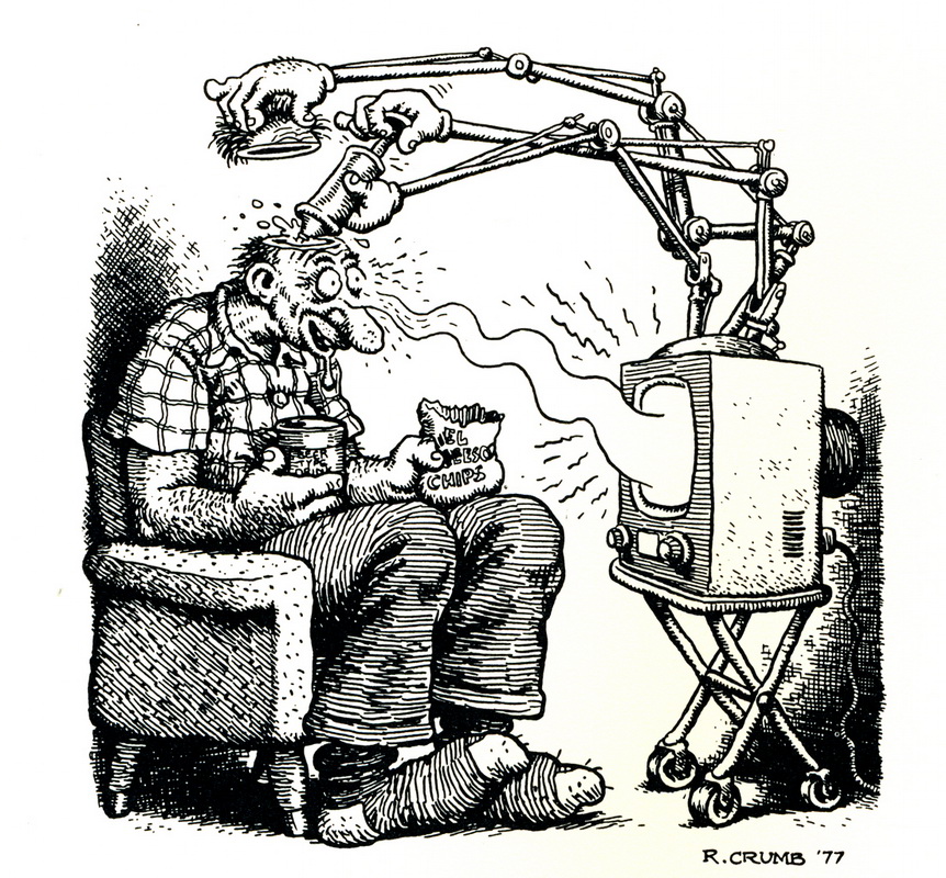
Robert Crumb - American cartoonist and musician. His work displays a nostalgia for American folk culture of the late 19th and early 20th centuries, and sharp satire of contemporary American culture. His work has attracted controversy, especially for his depiction of women and racial minorities.


Underground Comix

Underground comix are small press or self-published comic books which are often socially relevant or satirical in nature. They differ from mainstream comics in depicting content forbidden to mainstream publications by the Comics Code Authority, including explicit drug use, sexuality and violence. They were most popular in the United States between 1968 and 1975, and in the United Kingdom between 1973 and 1974.

Robert Crumb, Gilbert Shelton, and numerous other cartoonists created underground titles that were popular with the hippie counterculture scene. Punk had its own comic artists like Gary Panter. Long after their heyday underground comix gained prominence with films and television shows influenced by the movement and with mainstream comic books, but their legacy is most obvious with alternative comics.


End of 20th Century 

Punk style

Science-Fiction

Psychedelic

Growing market - magazines, advertising, film, books

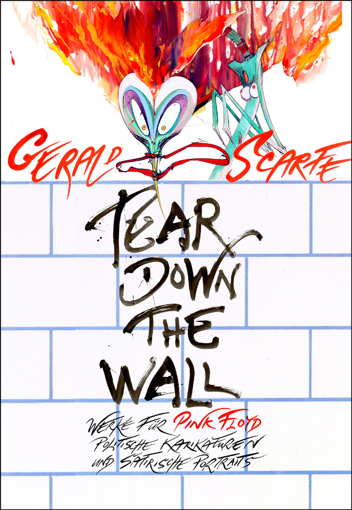
Gerald Scarfe -  English cartoonist and illustrator. He has worked as editorial cartoonist for The Sunday Times and illustrator for The New Yorker. Well known for his work for Pink Floyd. 


Gerald Scarfe 10

Maurice Sendak - American illustrator and writer of children's books. He became widely known for his book Where the Wild Things Are, first published in 1963. 


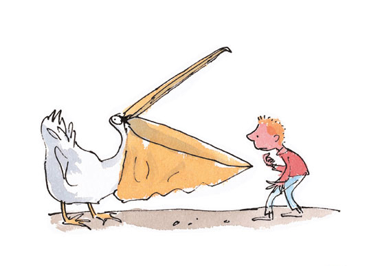
Quentin Blake -  English cartoonist, illustrator and children's writer. He may be known best for illustrating books written by Roald Dahl.


Illustration and Art 

"Today, there is a growing interest in collecting and admiring original artwork that was used as illustrations in books, magazines, posters, blogs, etc. Various museum exhibitions, magazines and art galleries have devoted space to the illustrators of the In the visual art world, illustrators have sometimes been considered less important in comparison with fine artists and graphic designers, the term "illustrative" sometimes being used as a negative critique. But, possibly in part due to the growth of video game and graphic novel industries, as well as a recent swing in value towards illustration in magazines and other publications over photography, illustration is becoming a valued, popular, and profitable art form that can acquire a wider market than the other two, such as in Korea, Japan, Hong Kong, and the United States. Original illustration art from the best-known magazine illustrators is known to bring prices into the hundreds of thousands of US Dollars at auction."


It is clear illustration has evolved and developed massively since it was first used. Nowadays, the term illustration is very vast and covers a wide range of areas - it doesn't even need a purpose anymore - just to simply make the world a more interesting place. There are thousands of illustrators, all with different styles and techniques of working and all working for different purposes. I think the word 'illustra'tio', the Latin word for enlighten, where the term illustration comes from, really sums this practice up - it delves into the persons mind and gives you their interpretation of how they think and how they see the world, and delves into their imagination. 

Some illustrators/cartoonists who inspire me

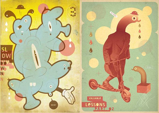
Sauerkids - Sauerkids is Mark Moget and Taco Sipma, an artist duo based in Rotterdam, the Netherlands. Besides their current day jobs as graphic designers, they started the label Sauerkids on the side as an outlet for their non-client based work. Their character based art has been shown in several international art exhibitions and projects.

They've been accused of "being on medication" but in the end their work is probably better described as a combination of innocent childhood imagery and the mental confusion of everyday life. 


Mr Penfold


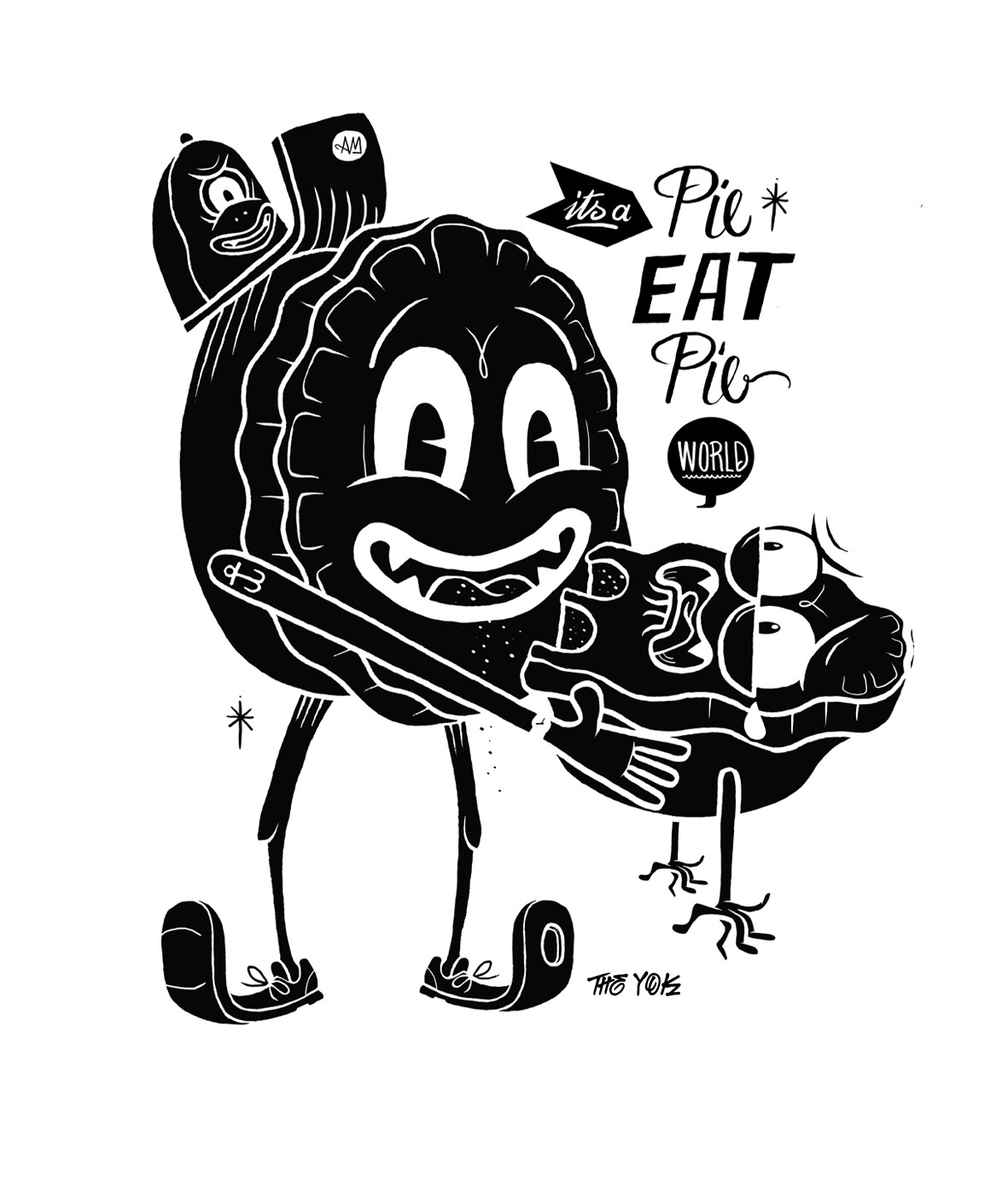
The Yok - Yok started his droopy eyed drawings in a salty sea shack down under in a town called Perth. He developed a passion for loopy moustaches, seaworthy beards and potato headed gargoyles. Loving the basic idea of Gargoyles- being placed on buildings to ward off evil, he adapted this thought and reinterpreted them in his own wobbly style.


HRVB - or like his friend alfonso call him "Herr", is a freelance illustrator and graffiti-lovin-artist. He lives and works in his hometown Berlin/Germany. 


yaam berlin

brezelhandboy


McBess - French illustrator living in London. His style is a mix of influences such as Fleischer Studios' old cartoons he actualizes by using contemporary shapes, symbols, and types. Mcbess's drawings often present himself at the center of a surrealist world filled with food and musical references, such as amps, guitars and records.


Christi Du Toit


John Antoski - 


Alberto Cerriteno - 


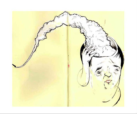
Alberto Cerriteño is a Mexican illustrator & designer who has lived in America; Portland for nearly four years now. Strongly inspired by urban vinyl toys, alternative cartoons, and the pop surrealism movement, Alberto Cerriteño has developed his own very personal technique and style, having always present a delicate hints of traditional Mexican artistic influences in his management of rich textures and decorative patterns. These contrast strikingly with the blending of desaturated colors and ink, sometimes featuring a vintage coffee finish. Alberto Cerriteño illustrations have been recognized by progressive art institutions such as Juxtapoz, Create, Drawn!, The Little Chimp Society, Computer Arts, Communication Arts and IDN among others.